Red Dot: Best of the Best for the new visual identity of mmcité+
The new graphic design of mmcité+ caught the eye of the international jury at the Red Dot: Brand and Communication Design Awards and it even won a place on the prestigious Best of the Best list in the category Corporate Design and Identity.
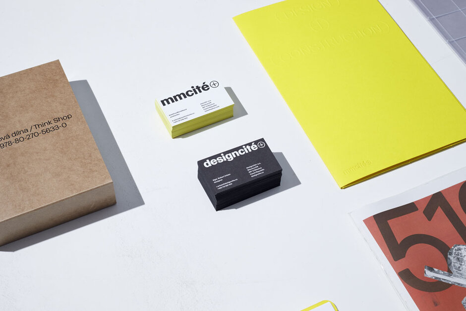
Mmcité+ is our sister company which operates in the field of transport infrastructure. In cooperation, we have had significant impact on how the role of design in public space is perceived in our country, as well as in the wider Central European region. It made sense that we also helped bring to life their new visual identity.
A good visual identity of a company must reflect its principles and ambience, cater to all kinds of company communication from large-format campaigns to invoices or digital media. It must grow from the previous graphic identity and at the same time anticipate future needs. The cooperation between the graphic artists, studio 519 and mmcité+ achieved this goal and the jury of the prestigious international design competition recognised it.
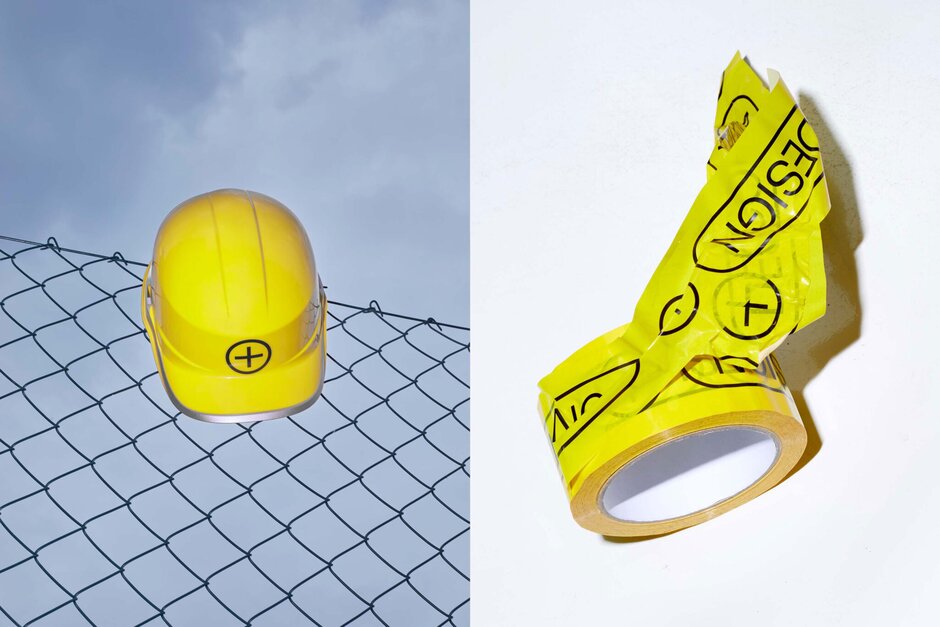
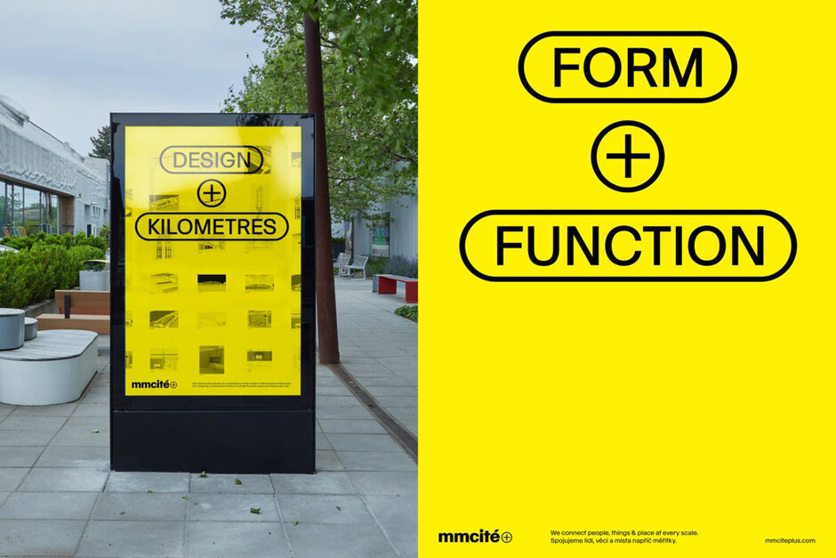
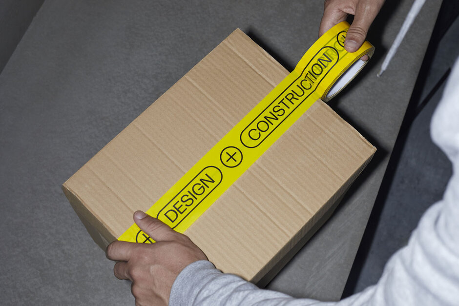
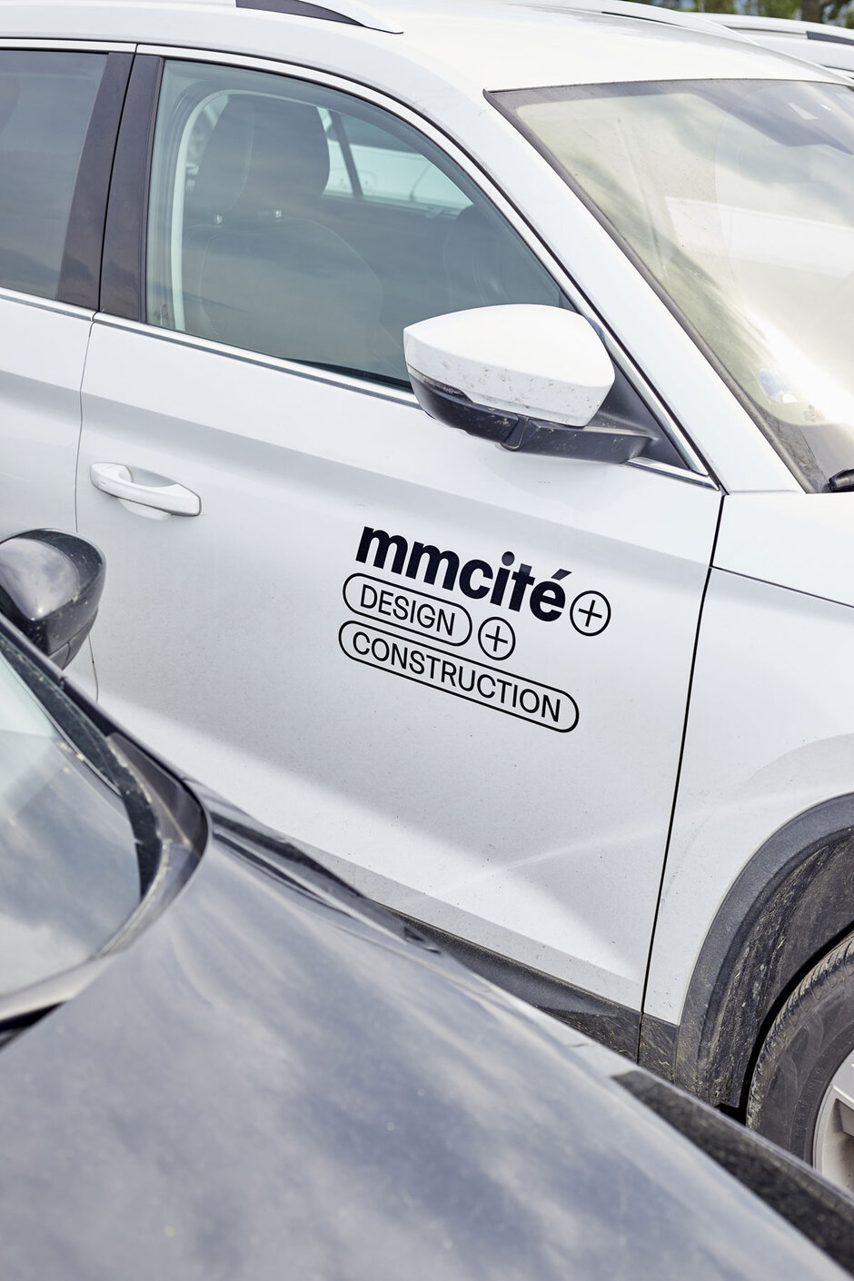
The authors of the new corporate identity, young graphic artists Jan Novák and Marek Nedelka, went as far as developing a new typeface called Cité Grotesk. This contemporary typeface designed in three fonts allows for great flexibility and serves all kinds of corporate communication. The symbol + was given a prominent role in the new logotype. It now enables to visually link together ideas and elements exactly as is typical for the practice in the mmcité+ brand (design+construction, form+function, etc.) The graphic system which connects key words works very well to communicate messages on posters, citylights and other larger-format media.